Datacrons
Star wars: Galaxy of Heroes
What are datacrons
Datacrons are a feature introduced into Star Wars: Galaxy of Heroes that is the first major swing towards implementing seasonality into the game. They are an item that plugs into PVP modes on a squad level, granting both stat and mechanic bonuses to qualifying squad characters.
The intent of the feature is to have a means for the game designers to be able to create meta shifting power without the risk of destabilizing the power balance permanently. As well it gives the ability for players to invest in, or feel rewarded for investing in under-utilized characters as they are boosted for the duration of the datacron’s lifecycle.
Especially because these datacrons are so powerful and also temporary, it was paramount to us in designing to give the players the ability to understand and craft these how they want to use them.
SOME GOALS:
Players can know every possible way they can configure their datacron within the set bounds
Players can never make a “bad” datacron. (That is, they can not roll or choose Light Side and then roll or choose a faction that has no light side units)
Players understand how early choices influence later options when upgrading their datacron
It is clear when datacrons are being applied to a squad, how that datacron will affect the squad. (Based on effect requirements, squad applicability, etc)
UX Wireframing
As this feature was completely new, there was hardly any existing UI pieces used in the wireframing stage. Instead, the layouts were built starting from a grey-box foundation to get the information architecture and hierarchy correct. The two primary screens of importance to the feature are the Datacrons Details Page, and the Equip a Datacron Page.
Datacrons Details Page:
Although we tried a few different layouts, the one presented here was the solution that had the best structure of increasing information specificity and complexity across the layout. We start with the high level datacron object on the left, laid out to have symmetry with the datacron widget used outside of this view (example of which being in the Equip View). Down the middle is the level list that breaks down the information that has been unlocked already in a consistent and digestible format regardless of bonus effect type. Finally, on the right is the Level Details panel that has variable information depending on if the level is a stat or mechanic and based on it’s unlock status. This panel is where a player can learn what to expect when upgrading to any particular level.
Equip a Datacron Page:
This view started out primarily focusing on having a way for the player to easily look through their inventory of datacrons and see how well any of them may affect or even apply to the squad they currently have built in pre-battle. The right side has a breakdown of unlocked mechanic levels and shows who on the squad may be receiving the effect based on alignment/faction requirements.


UI Development in Details
The UI in the Details Page went through an exhaustive exploration in color, shape and details. A goal we had in the screen was to inject a little more hue variation in order to move the screen away from the monotone hue space that is common in SWGOH.
In exploring the levels list, I started by using some of the panels we had in the game to get a quick read on what shapes and hues we could immediately exclude from further experimentation and what had potential to be good exploration opportunities. I endeavored to create separation between stat effect levels and mechanic effect levels through a subtle change in details and shape to the panel. This had the added benefit of breaking up some of the rigidity of flat sided rectangles filling the center of the screen. Lastly, I tried to reduce weight as much as I could to give visual breathing room in the UI, which is why the panel holding the right side information was removed when going into the final UI.
Of note, a part of the UI that had some of the most focus and refining was the target list in the level details panel. Having a clear display of what a level could or could not potentially roll when performing an upgrade or re-roll was crucial for the player to be able to make informed choices on where they invested in datacrons.
An important piece of the datacron UI is the medallion widget. It shows the player the effect that is unlocked on a datacron and on the level in the details. This medallion in details needed to read as a socket to be filled when not unlocked, and read cleanly with the alignment, faction, and character icons when active while also appearing lit up.
Broad Exploration of color, value, and shape details in Details View
Exploration of Color, Value, and Style for the basic datacron medallion component
UI Development in Equip View
The Equip View turned into the primary focus of prototyping efforts and iteration in order to get the information clarity just right. In this context, there are several factors that can affect how good any individual datacron is for the current squad:
How upgraded is the datacron?
How many mechanic affixes would apply to even one character in my squad?
Do the members of my squad meet the requirements for that effect to be active?
This breaks down to the player needing to ask:
What is each datacron’s effective level?
What mechanics will be active in battle if I equip this datacron to this team?
If any mechanics are unlocked but not active, what would I need to change to make that effect active?
In order to facilitate the easiest read, we chose to create a high level of contrast to make the “active” gold color pop in the inventory side so the player only needed to first look for the most gold on any datacron, and then could narrow down from there.
The treatment that I got into a clean state in the inventory list was then reflected in the detailed view on the right for every datacron, so that the player could easily make a connection to what the colors and values correlated to. When we prototyped this design with testing players, they were able to very quickly learn the meaning of these colors without any explanation or assistance from the designers.


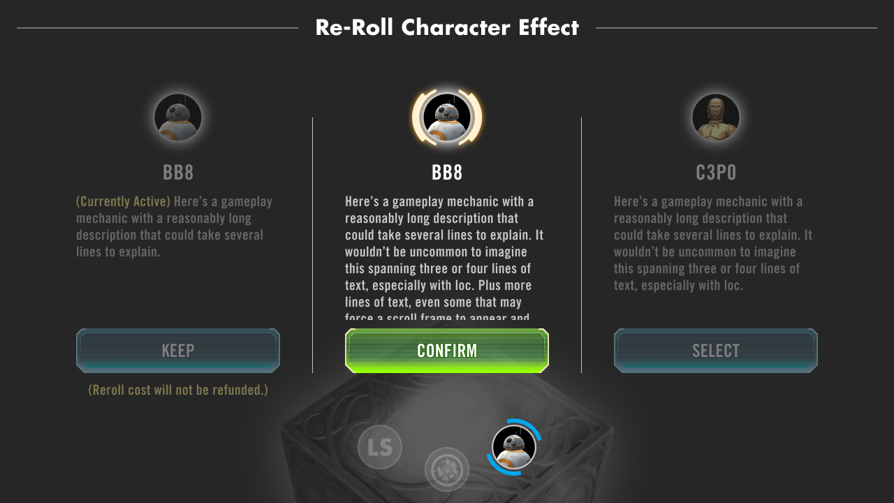
Final UI in re-roll
Although the re-roll view did not have many big changes in the development of the UI for the feature, it did get some valuable refinements. Most noteably, I designed for the stat re-roll screen a meter that displays to the player how well they rolled in the possible range for a particular stat, so the player could have a very quick read on the value of the options presented to them.
UI Animations
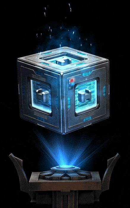
I did not author the visual targets for the animation moments on this feature. However I was instrumental in implementation of these sequences in the engine.
I utilized timeline in a new way that the team had not been using it up until this point to build sophisticated sequences that allowed designers to have more control over timing and easing than we had before. The process also significantly eased the scope of the engineering effort to support these sequences.
The end result was one of the most ambitious and high quality set of sequences in the UI to date with a lower overall engineering cost than prior processes would require.