
Player experience & business goals
The primary player we were targeting with this feature was one who was highly invested in the game and interested in accelerating their progress.
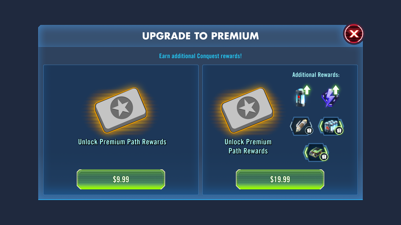
We wanted to leverage the existing prize track to show both free and pass rewards for progress made in conquest so players could see and understand the value of the pass easily. In addition, we wanted to have two tiers of pass to give more options for how much players would want to invest in their accelerated progress.
Research & recommendations
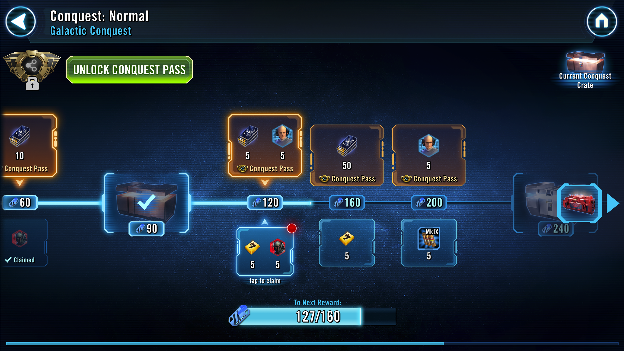
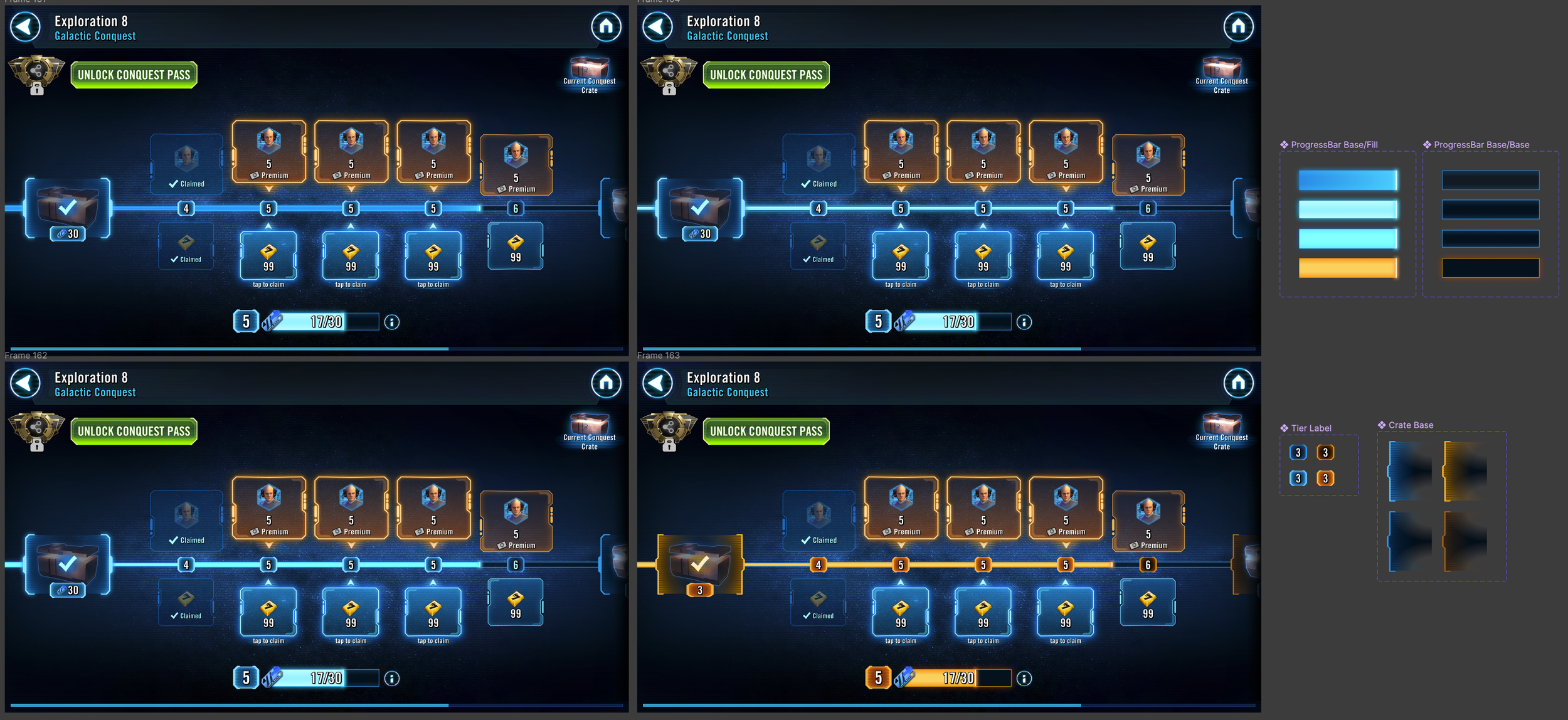
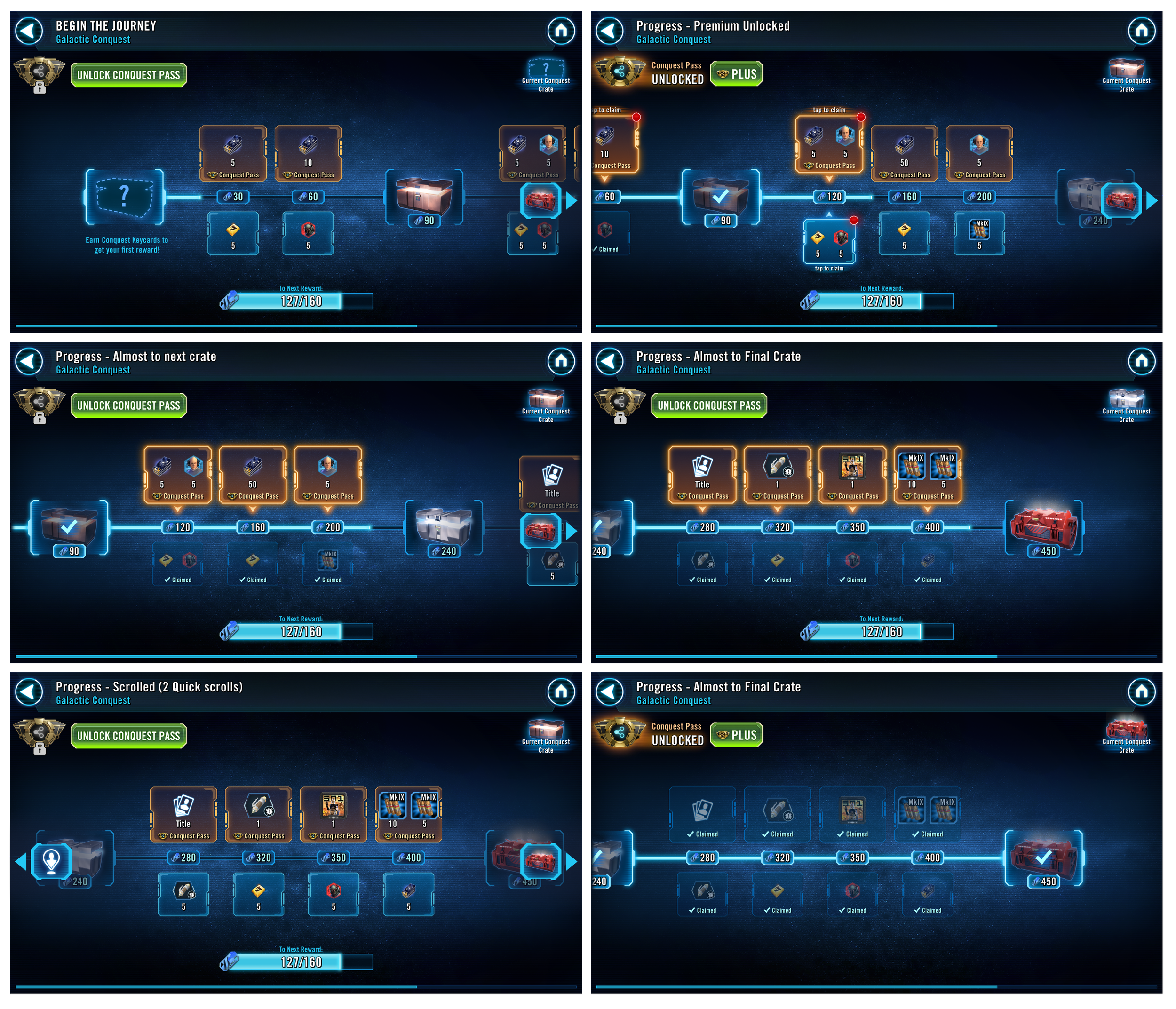
In researching for this feature, of course I started with understanding the current prize track. There was a fundamental structure that was not changing that needed to persist through the update. That is, the track gives the players both instant rewards for surpassing thresholds as well as having some thresholds represent an upgrade to the end of event prize-box. It was imperative that the distinction between the two types of threshold rewards was clear in the final.
In looking at how similar games approached a prize track, there was a lot of variability in how those games did and did not meet our goals. The breakdown of how successful or unsuccessful the comps were for what we needed was very helpful in understanding and generating specific recommendations for solutions or approaches as we developed our feature.
Old Prize track UI

Flow Map
Although the feature had most of it’s focus in a known space, there were significant updates to all of the access points to the prize track to account for tiers of rewards, reflections of pass benefits throughout the feature UI, and new purchase access points in the game.
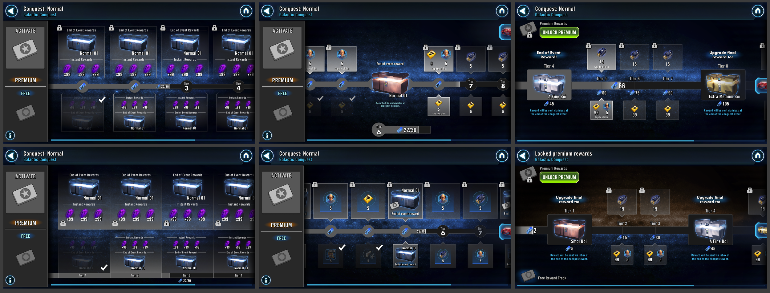
UX WIreframes
The early stages of the wireframing process was all about getting hierarchy of information to read cleanly in the prize track. This involved trying a range of layout solutions to fit information in different ways, and separate free versus premium clearly.
Early on we discovered the importance for the instant rewards to have tap affordance as the prize track was where the players were going to claim those frequently. As well, we learned how structuring the end of rewards prize box as being part of the overall progress was vital to separating it from the instant rewards and not confusing players.
Getting the structure of the hierarchy was crucial to make clear before moving into UI art as a comparative measurement for information clarity.
UI Design Process
Presented here are a couple of examples of the explorations to demonstrate how I will reach a UI solution from wire frames to final shape/color/style.
As in the example of the bubbles for both free and premium instant rewards, I take the wireframes as a starting point, and I do a number of iterations playing with shape, while attempting to maintain relative value hierarchy across states. Once I have landed on a shape that feels like it is evoking the brand while maintaining the needed value steps and affordances, then I start introducing color. The idea is covering a lot of ground while the investment required to get the idea across is low before drilling deep into an approach that we have more confidence in. A separate aesthetic goal of the process is to find ways to make new UI pieces that we can either re-use in appropriate contexts or use as inspiration to elevate the UI to a higher quality going forward.
In the example of the refinement of the progress bar, this was a fairly constrained problem space that required some nuanced work to get just right. Our backdrop happened to layer with the progress bar in a very middle value space, and with the majority of the UI being very blue, I wanted to get confidence in making sure that the color and treatment felt in harmony with the hues of the rest of the UI as well as creating the proper value separation both from the background and the empty progress.
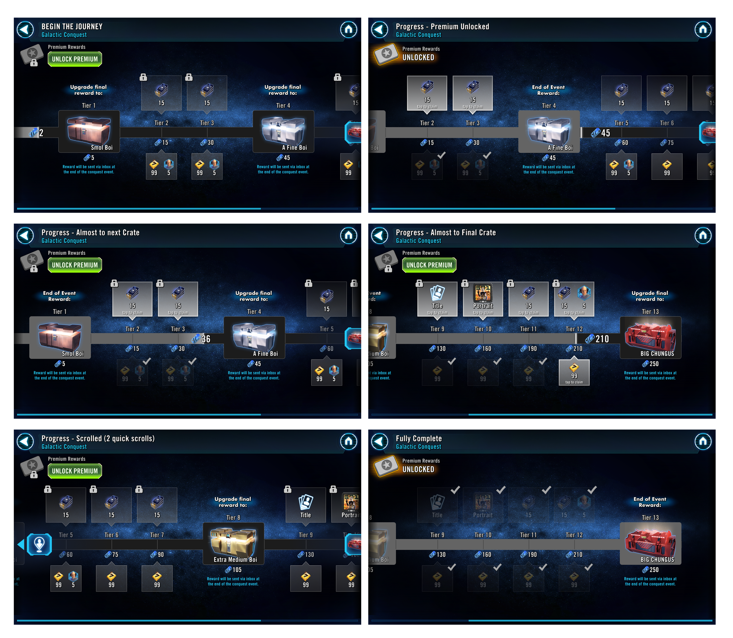
The last image is an example of creating mocks that cover the full range that the UI can go through so that we can check to make sure our information hierarchy has been maintained from wireframes through final art.
In addition to generating all of the UI art needed for this feature update, I implemented all of these designs with UI engineers into Unity. I worked with a resident VFX artist to get proper vfx, directing them towards a style and final effect that we needed to give good and satisfying feedback to players when collecting their instant rewards.

Full Flows
Below are examples of how the various flows were constructed and laid out for full coverage of state and interactions. Any flows that had versions based on support availability were marked accordingly.